
Mobile-Optimized Website for Your Business
The web is rapidly evolving into a mobile information platform. Smartphone use is up sharply in the past several years, and as more and more users migrate to a mobile browser (Apple iPhone Safari, Android/Droid browser, and the Blackberry browser), formatting your website for the mobile crowd is a must. iPad style portable computer use is escalating sharply as well.
Why Can't My Regular Website Work in a Mobile Browser?
Your current website probably will load and display in a mobile browser… sort of. The first issue is the physical size and dimensions of a smartphone are drastically different from a desktop or laptop computer. Common computer resolutations start at 1024 x 768 pixels and get larger; smartphone screen dimensions are much smaller at 320 x 240 for example (common size on some devices).
While the content from a web page formatted for a desktop computer can be viewed, it's a pain, requiring lots of zooming and scrolling. You know what? Mobile users just aren't that patient. They need their information, and they need it now.
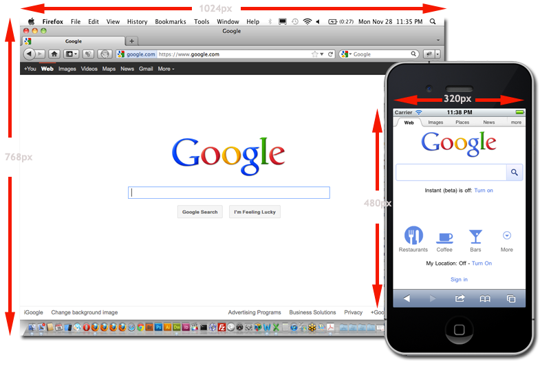
The first reason why your website needs a mobile makeover: comparison of a desktop browser size (1024 x 768 pixels) vs. smartphone browser size (320 x 480 pixels) and the change in orientation.
What's Involved in Optimizing a Website for Mobile?
Optimizing a website for mobile involves re-thinking the layout, whether or not to include images (images require a lot of bandwidth to download) or videos, more convenient menus… pretty much a redesign for most websites.
One alternative is to redirect users to a special mobile version of your website using a sub-domain (like "mobile.website.com"). That typically requires maintaining two separate websites.
Another alternative (which we recommend) is to code your website to detect the user's browser (you didn't really think this internet thing was anonymous did you?) and display the content in a format that works in their mobile browser, including customized menus, not displaying images, etc. This method works best if your site is running on a content management system (like WordPress or Concrete5), where the actual content is stored in a database, but the information is formatted on the fly.
iNvision Studios can optimize your current website for the mobile web, migrate your site to a content management system, design a new site with a mobile version as part of the template. We can work with your budget and website to make your look good on the go! See our contact information on the right or visit the contact page to find out more about mobile websites for your business.